Understanding Government Transfers
Informing and prompting conversation about the sustainability of government transfer spending
Team
Periscopic
Year
2024
My Role
Concepting, Information Architecture, Design Strategy, Visual Design
Project
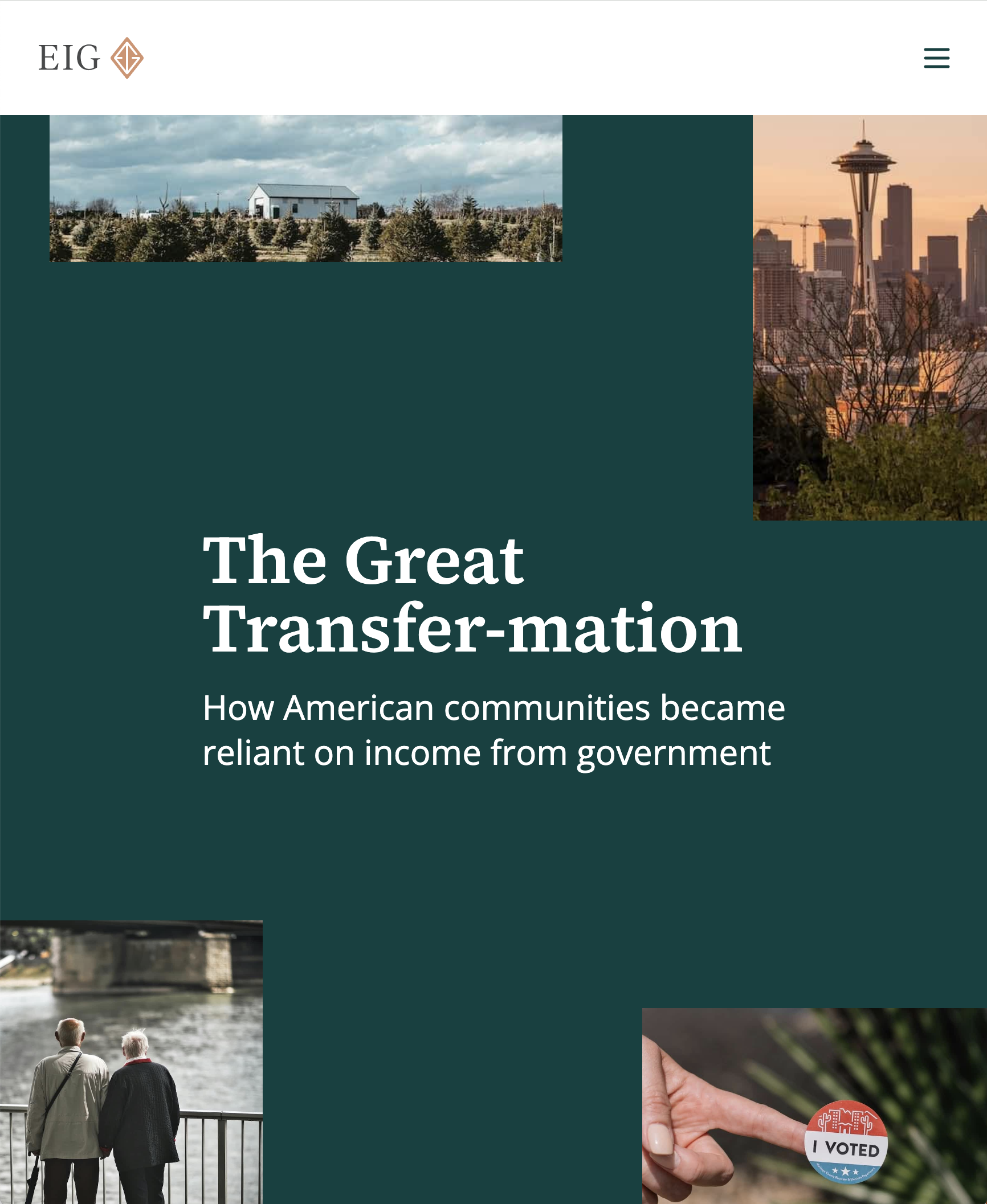
In partnership with the Economic Innovation Group this project is a scrolling narrative and interactive map experience to complement EIG’s ‘The Great Transfer-mation’ report, which explores the rise of government transfers in American income over time. The first four sections feature narrative text alongside supporting graphics and visualizations, followed by an interactive map where users can explore government transfers at a county level. Visit the live project here.
My Contributions
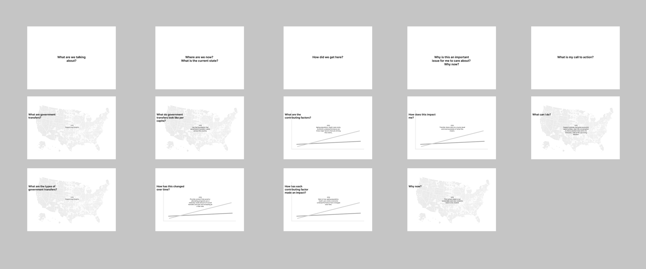
I contributed to the concepting and strategic phases of the project, deconstructing the client's report and organizing the information into an easy-to-understand narrative. I led the UI/UX and visual design process to deliver a responsive, intuitive experience that made the data both engaging and accessible for a wide audience.
A county-level map serves as the backdrop for much of the scrolling narrative, which reveals graphical insights that align with key parts of the storyline.
Building an Accessible Narrative
At Periscopic, I worked on a variety of projects, each unique in its content and complexity. Some had vast amounts of data, while others relied heavily on long-form content. This project was a mix of both. To meet the client’s goals and resonate with the audience, we focused on distilling the long-form content down to its core concepts, ensuring it was accessible and easy to understand. From there, we layered in more detailed information and refined the language to suit the target audiences, keeping in mind that the narrative should remain straightforward while the graphical elements can provide more nuance.
We made a conscious effort to use language that would resonate with visitors that are unfamiliar with the subject and simplifying concepts that might otherwise feel counterintuitive.
When the map wasn’t central to the narrative, animated time series charts and graphics were used to more effectively illustrate the key points and engage users.
Optimizing Navigation for Key Audiences
In designing navigation for this project, we prioritized the needs of politically engaged users—journalists and government officials—who would likely revisit key sections frequently. We implemented a dropdown menu with anchor links, a unique feature in scrolling narratives, to let users quickly reference different parts of the project. This was especially useful for providing quick access to the explorable map, where professionals looking for localized insights could detour the narrative and dive right into county-specific data.
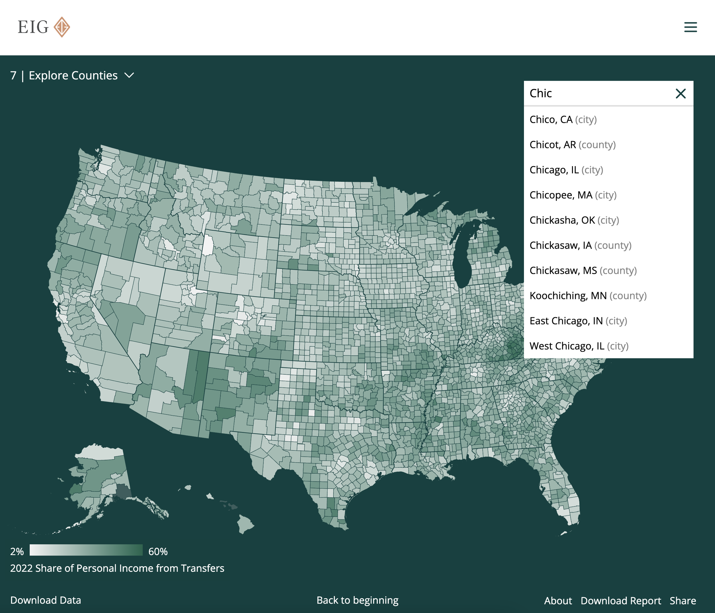
Navigating data constraints is a familiar aspect of the strategic design process. In this project, we were focused on county-level data, which can be more challenging for users to navigate as metropolitan areas are generally more familiar than individual counties. To address the potential frustration users may experience if they are unable to pinpoint their area of interest in terms of counties, we configured the search feature to return metropolitan areas above a certain population threshold and designed a mechanism for users to jump to noteworthy counties directly from the side panel. Including a way to explore counties directly from the side panel was an especially useful responsive design solution, which allowed mobile users to explore counties with greater ease without referencing the map.
We designed the search feature to populate county names based on larger metropolitan regions, making it easier for users unfamiliar with county names to find relevant locations.
The explorable map makes it easy to identify national trends at a glance, where users can then delve deeper into individual counties via a dynamic side panel, which presents the selected county-level data using the same graphs from the narrative.
Adapting Designs for Mobile
When adapting designs for mobile, adjustments were made to ensure usability and engagement, including refining menu interactions and reconfiguring horizontal charts for vertical displays. Modifications also addressed how text would scroll over background graphics, and how the interactive map and side panel would function. Notably, the side panel, which expands to full width on mobile, features a county section mechanism to improve exploration of more counties for mobile users.


